Campaign
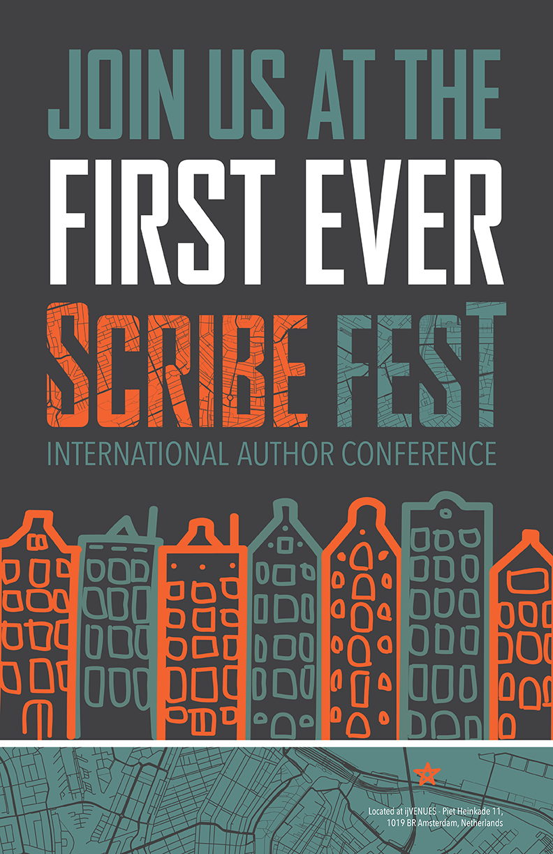
Scribe Fest
Task: Draw a city from a hat and create a conference that would be hosted within the city.
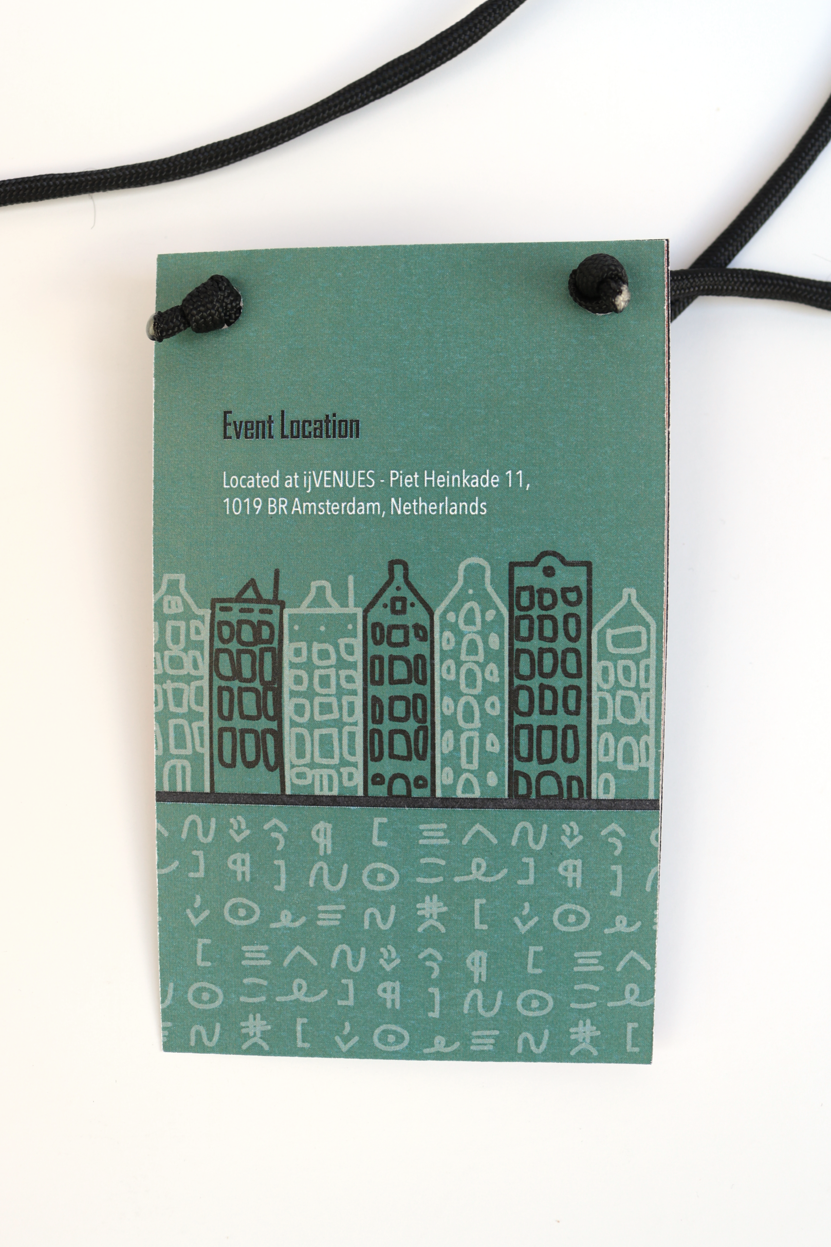
City: Amsterdam, Netherlands
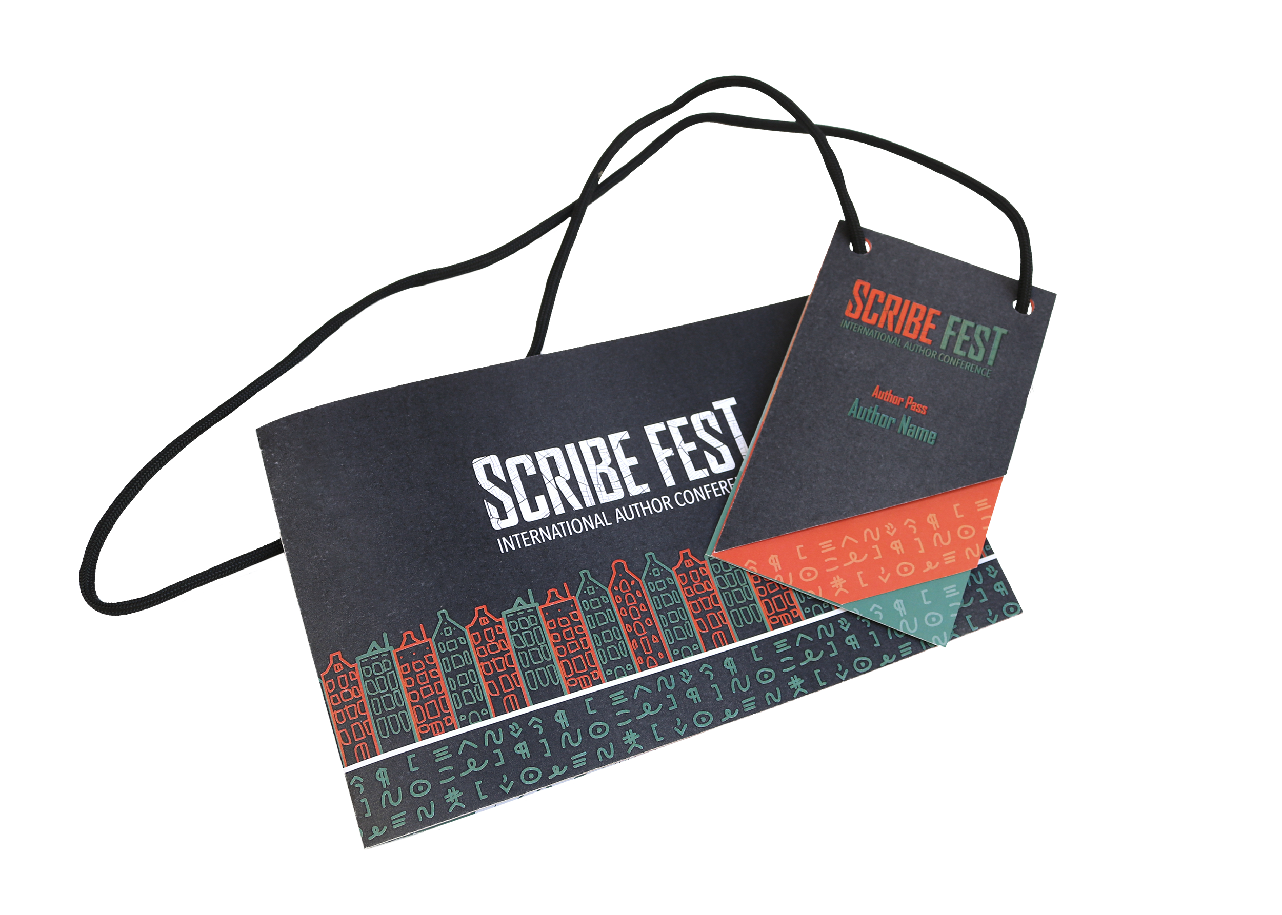
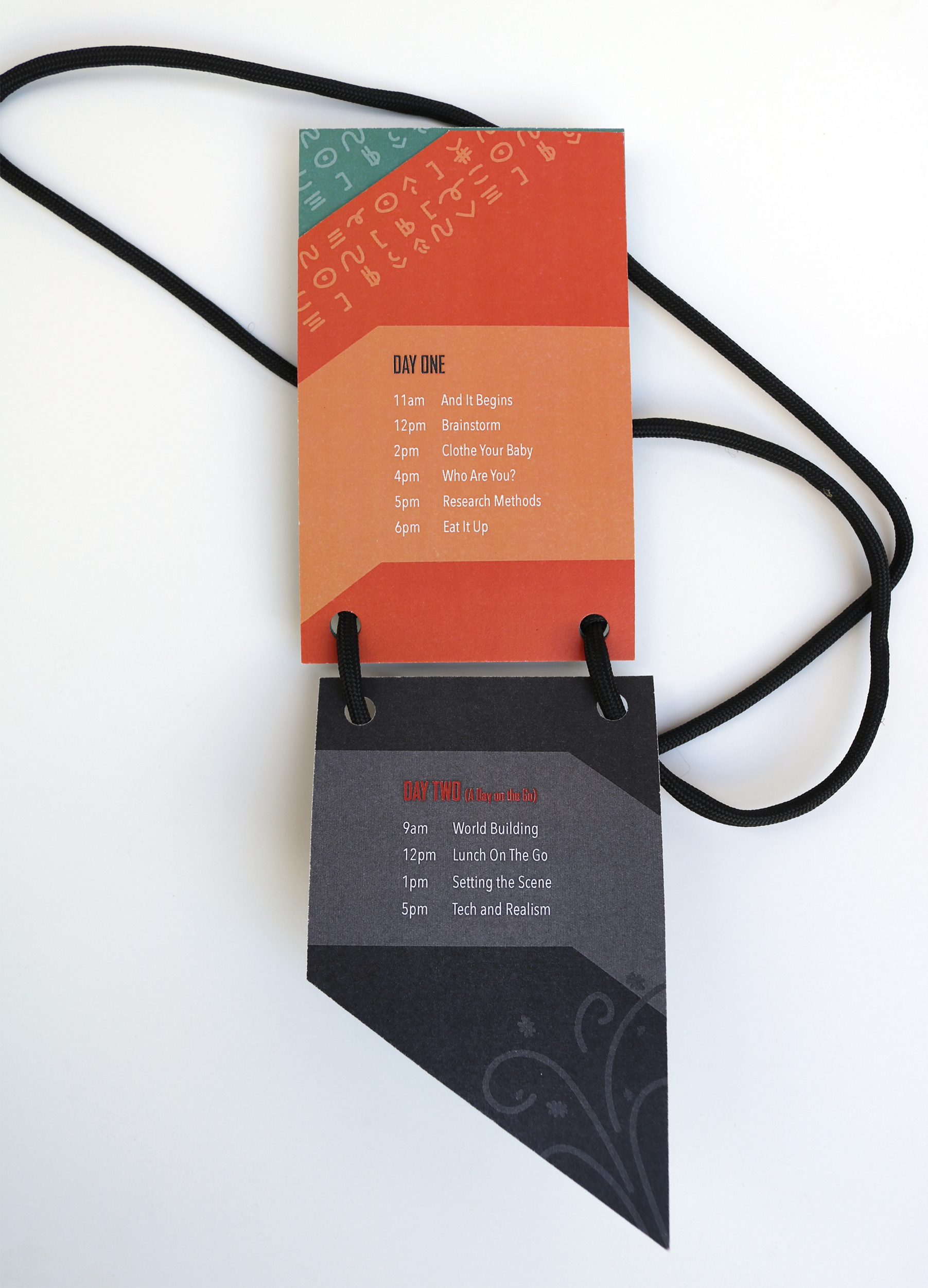
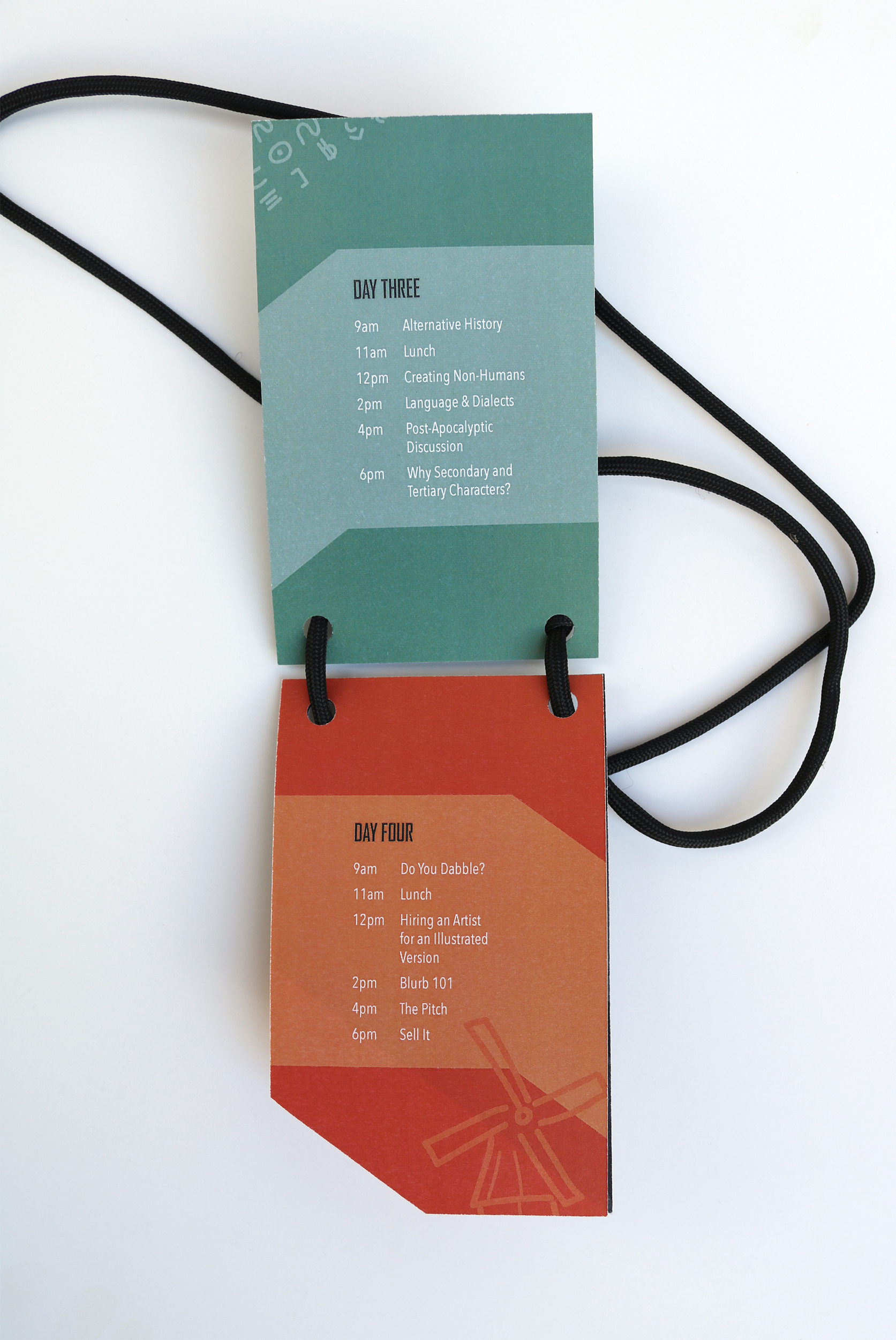
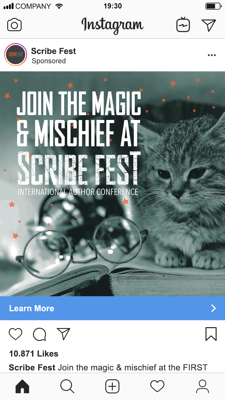
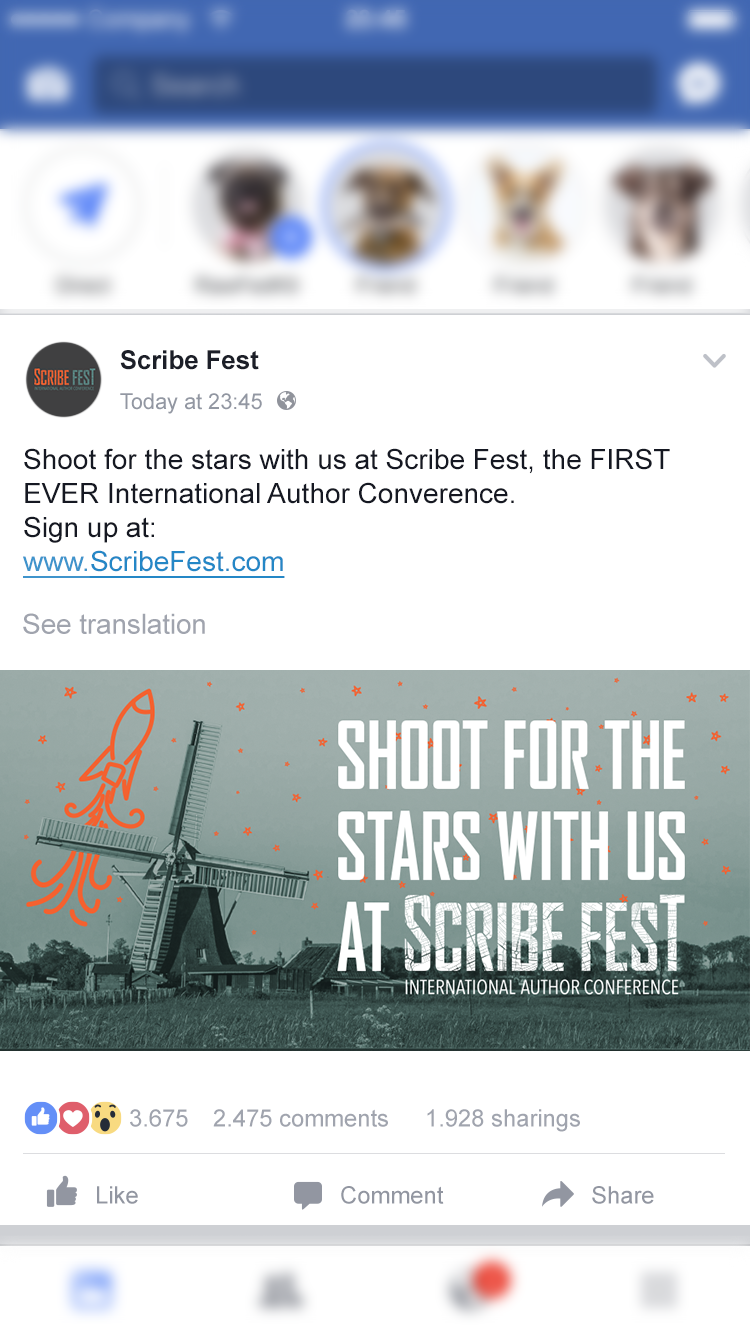
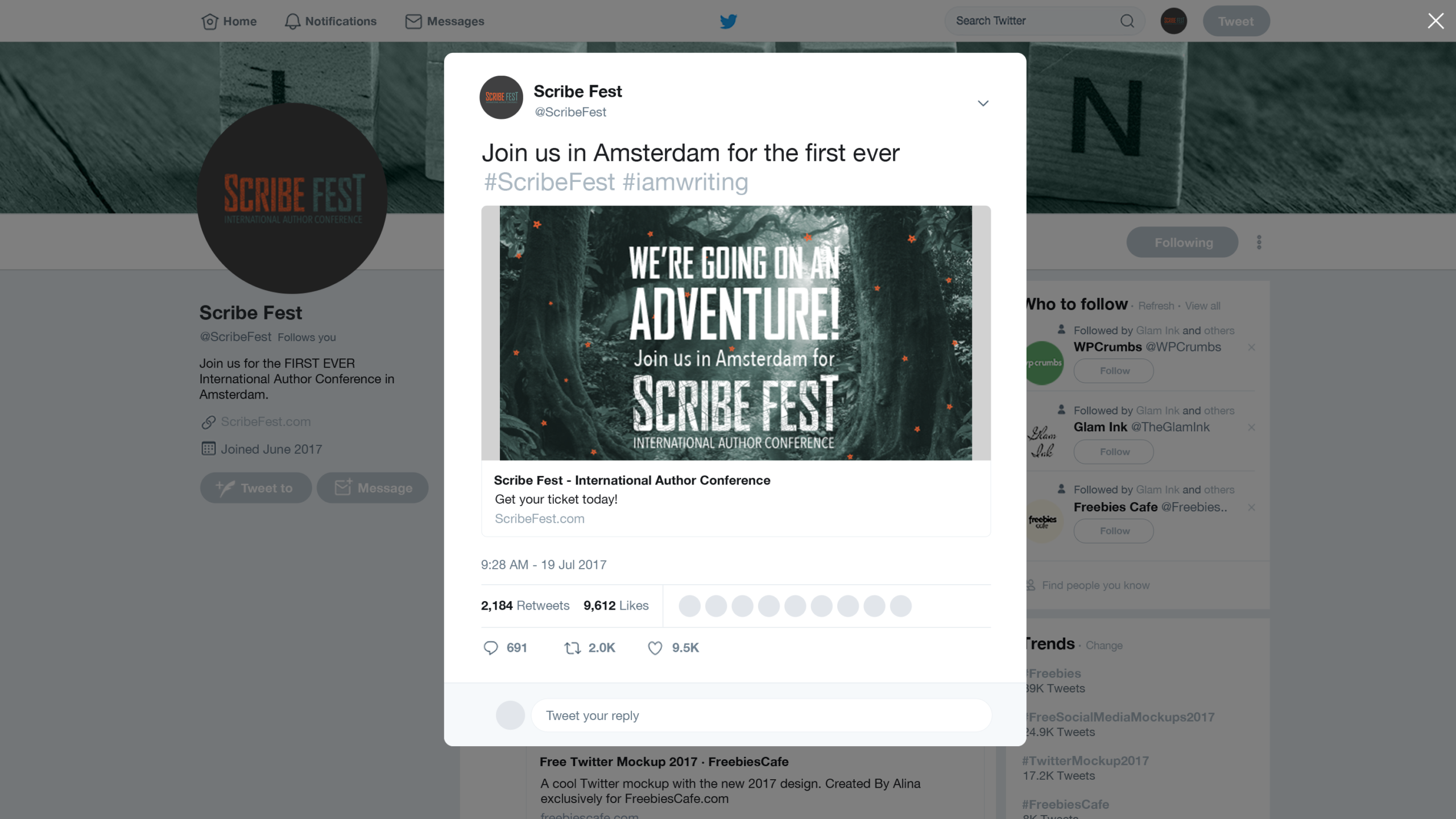
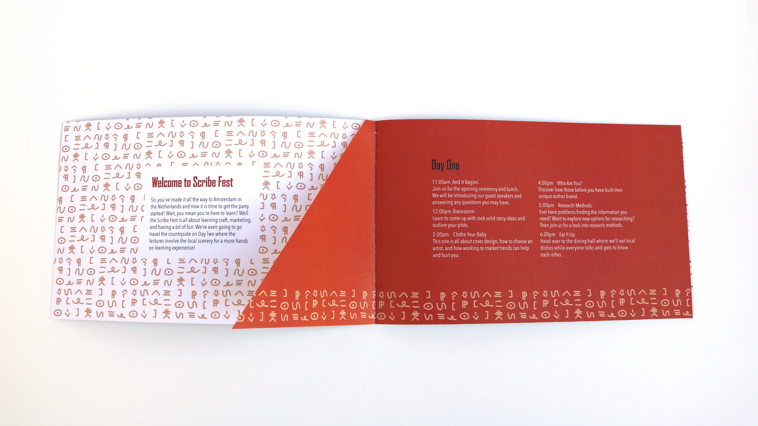
Process: After researching Amsterdam and the Netherlands, I ended up going with an Author Conference. From there I brainstormed names, researched colors and textures related to Amsterdam, and reached out to my author friends for what they would want lectures on. After a lot of sketches and rough drafts, Scribe Fest was born.
I decided to use orange for its significance to the royal family and use by the football team, teal as a complement and reminder of all the waterways, and a dark grey so as not to have such a harsh contrast within the designs.
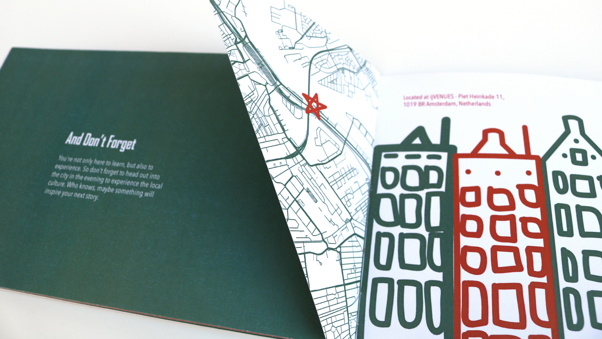
I knew I needed a texture, but the first textures that came to mind such as a grunge texture made the conference feel as though it was for old hand written texts rather than modern day authors. After some exploration, I decided to vectorize a street map of Amsterdam itself and use that as my texture.
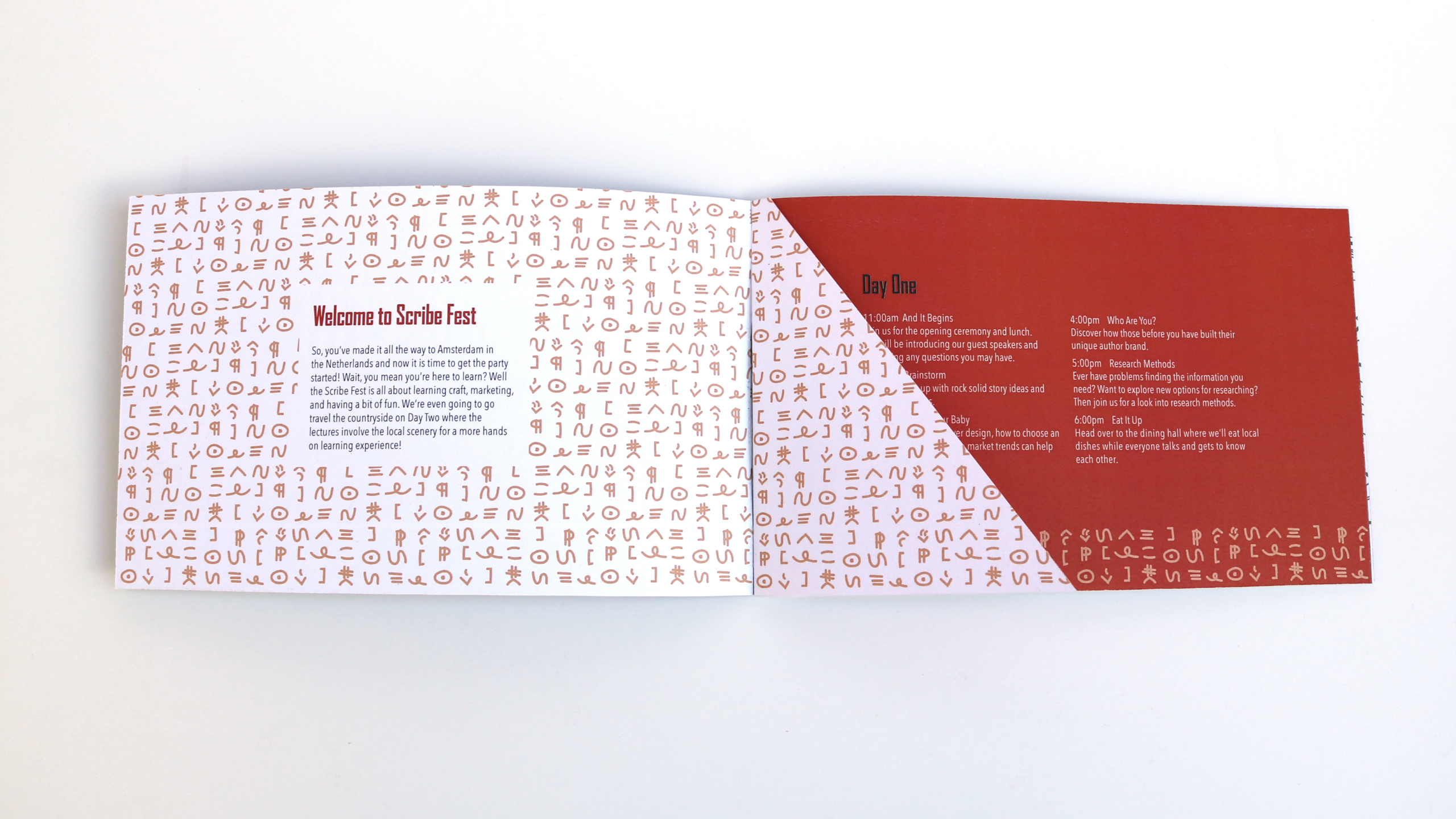
I also wanted a pattern, but unlike the colors and texture which would change to reflect the conference’s location. I wanted the pattern to be something that would stay the same as the conference moved around the world. So that is how I ended up using editor marks to create a fun pattern, thus turning something usually dreaded by authors into something fun and playful.
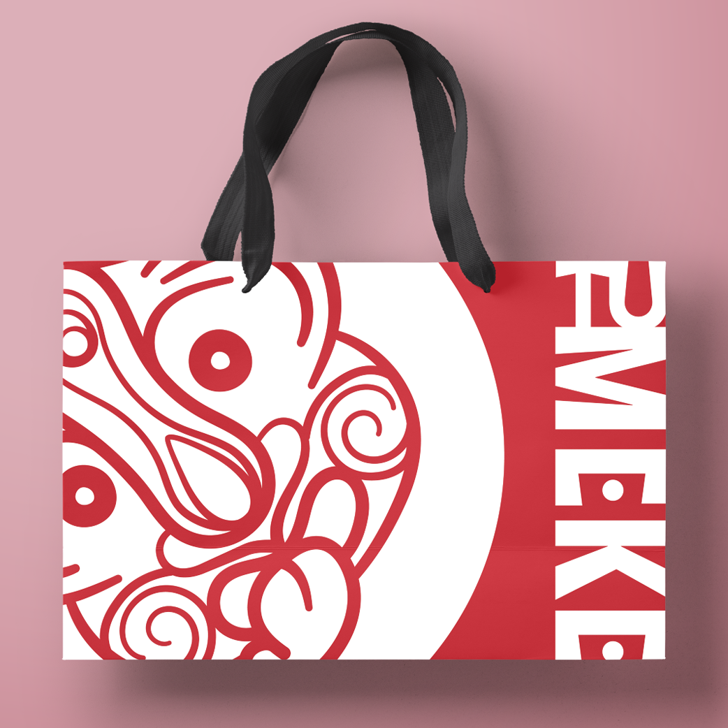
The loose illustration style of the pattern was a good contrast to the structure of the logo and map which I chose to incorporate into the illustrations throughout the rest of the brand.
Categories
Branding
Print Layout
Social Media Campaign
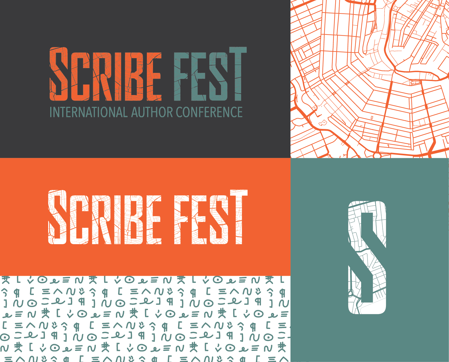
Scribe Fest Brand Guide
