Restaurant Branding
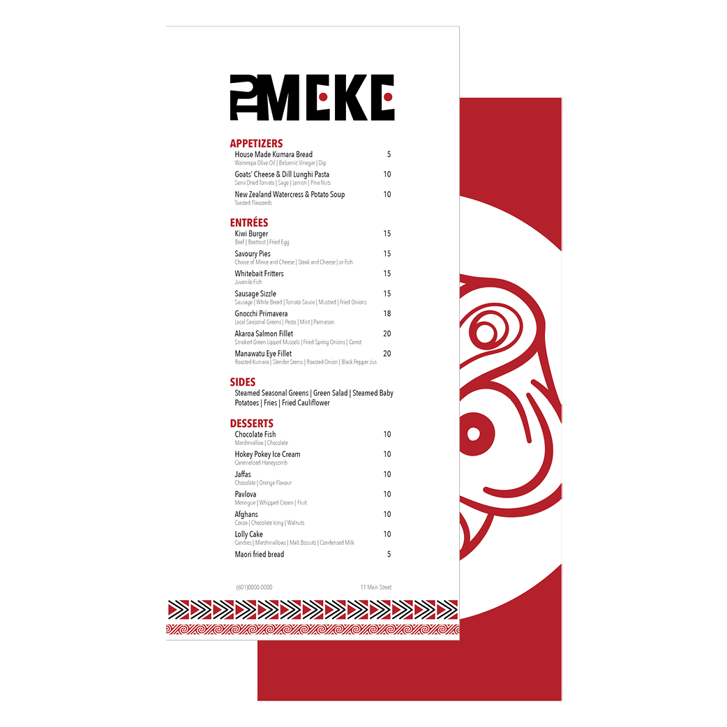
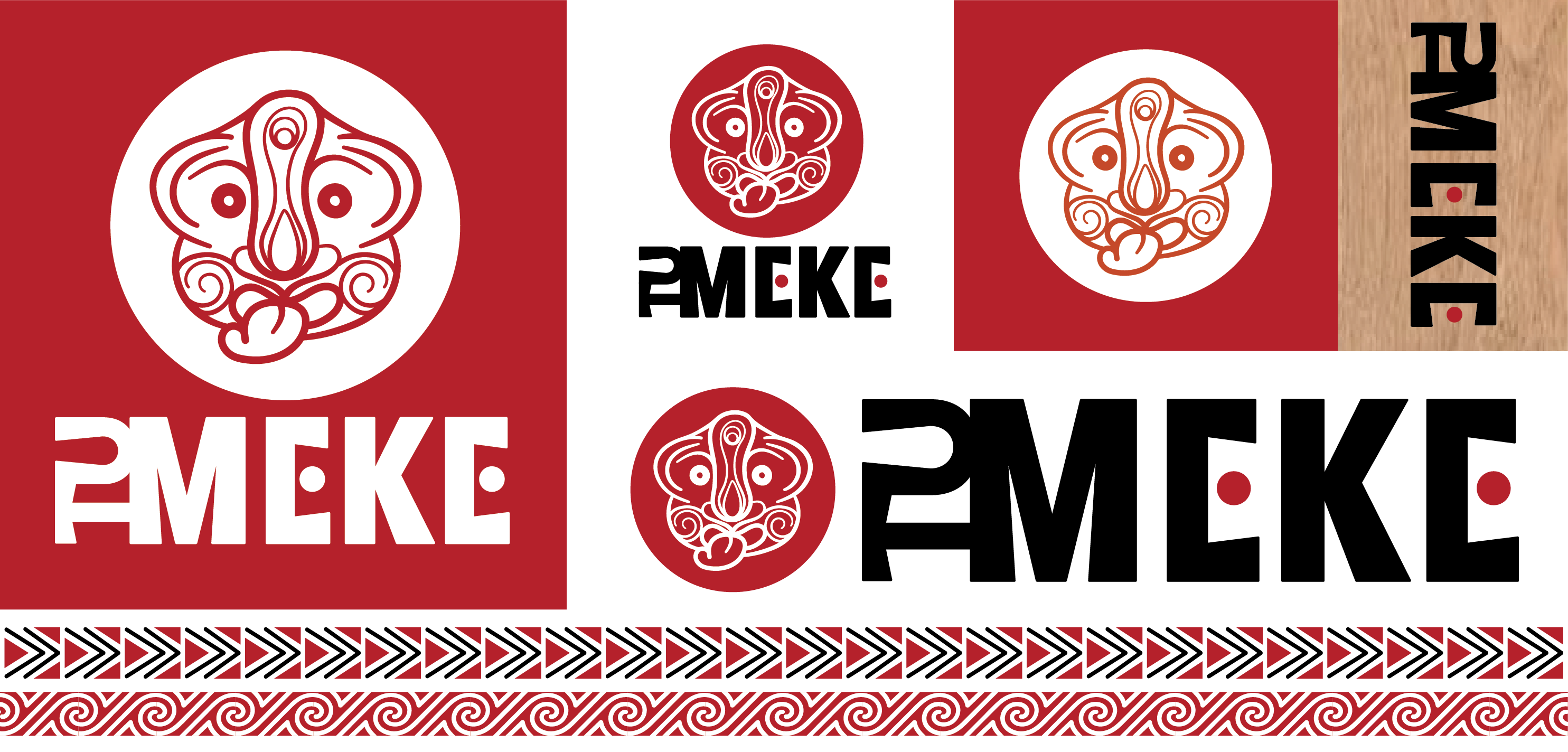
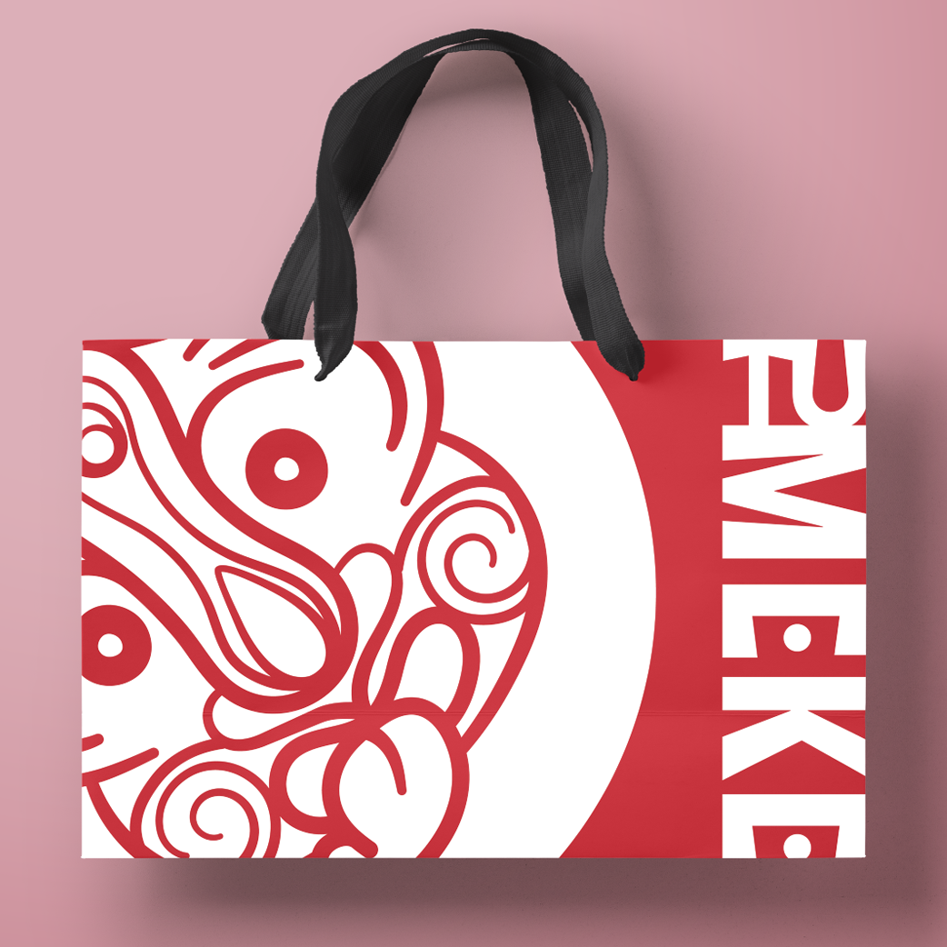
Tu Meke
Task: Choose a country to base a restaurant on.
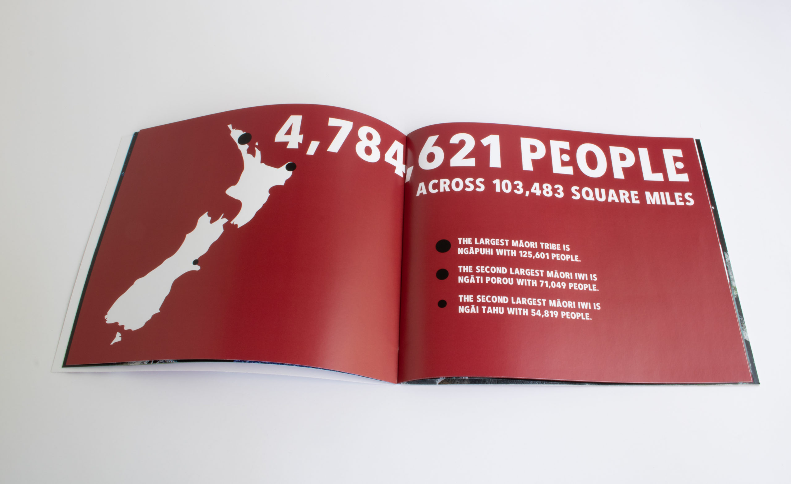
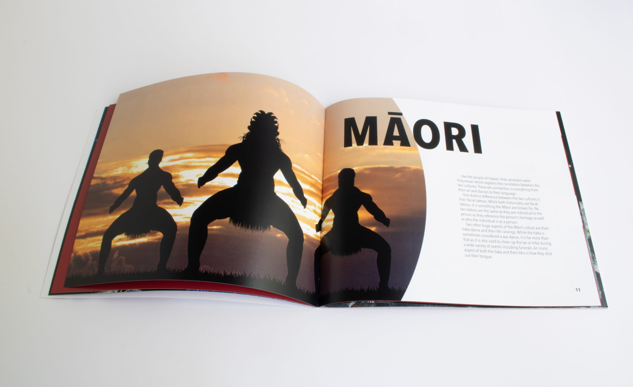
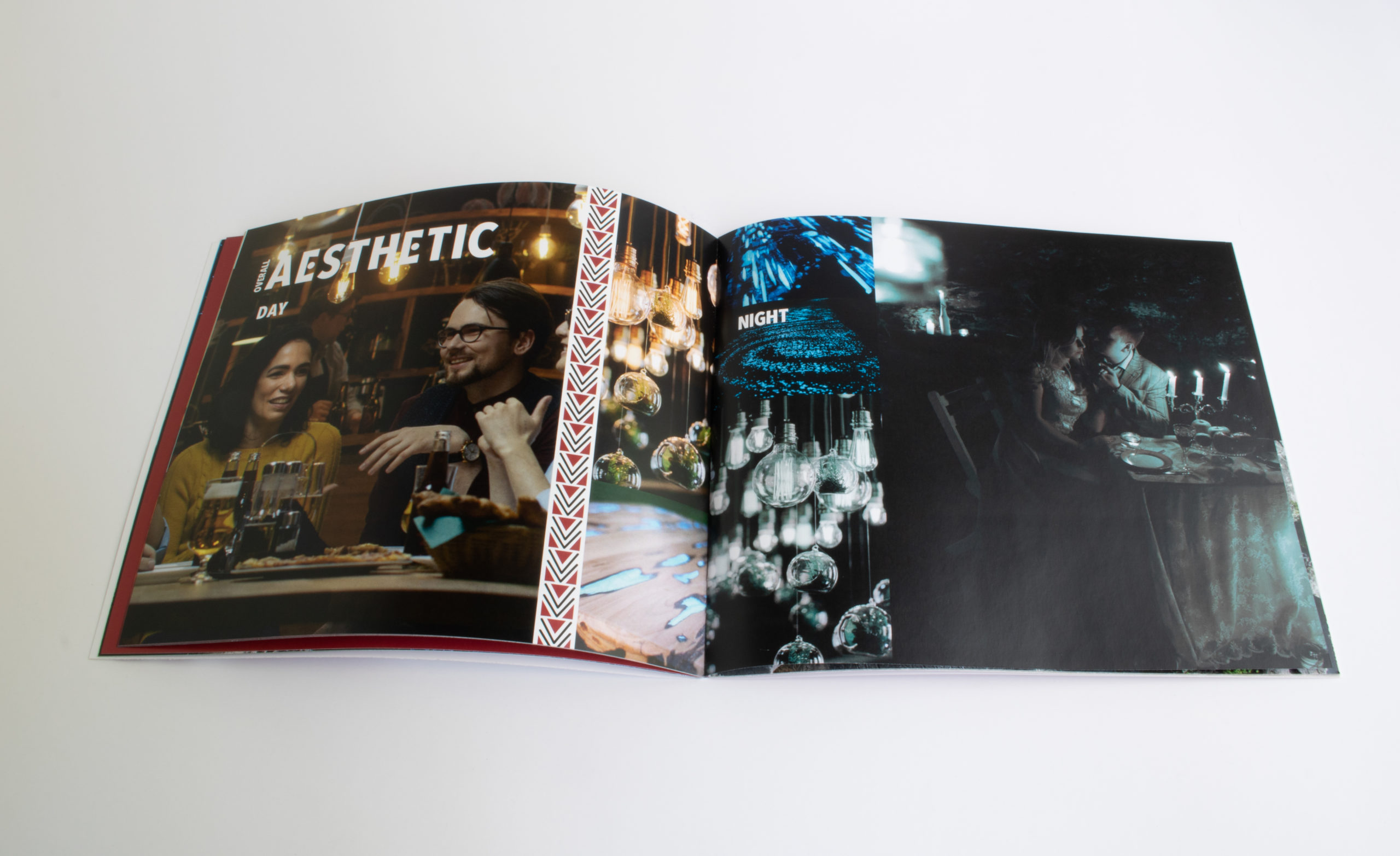
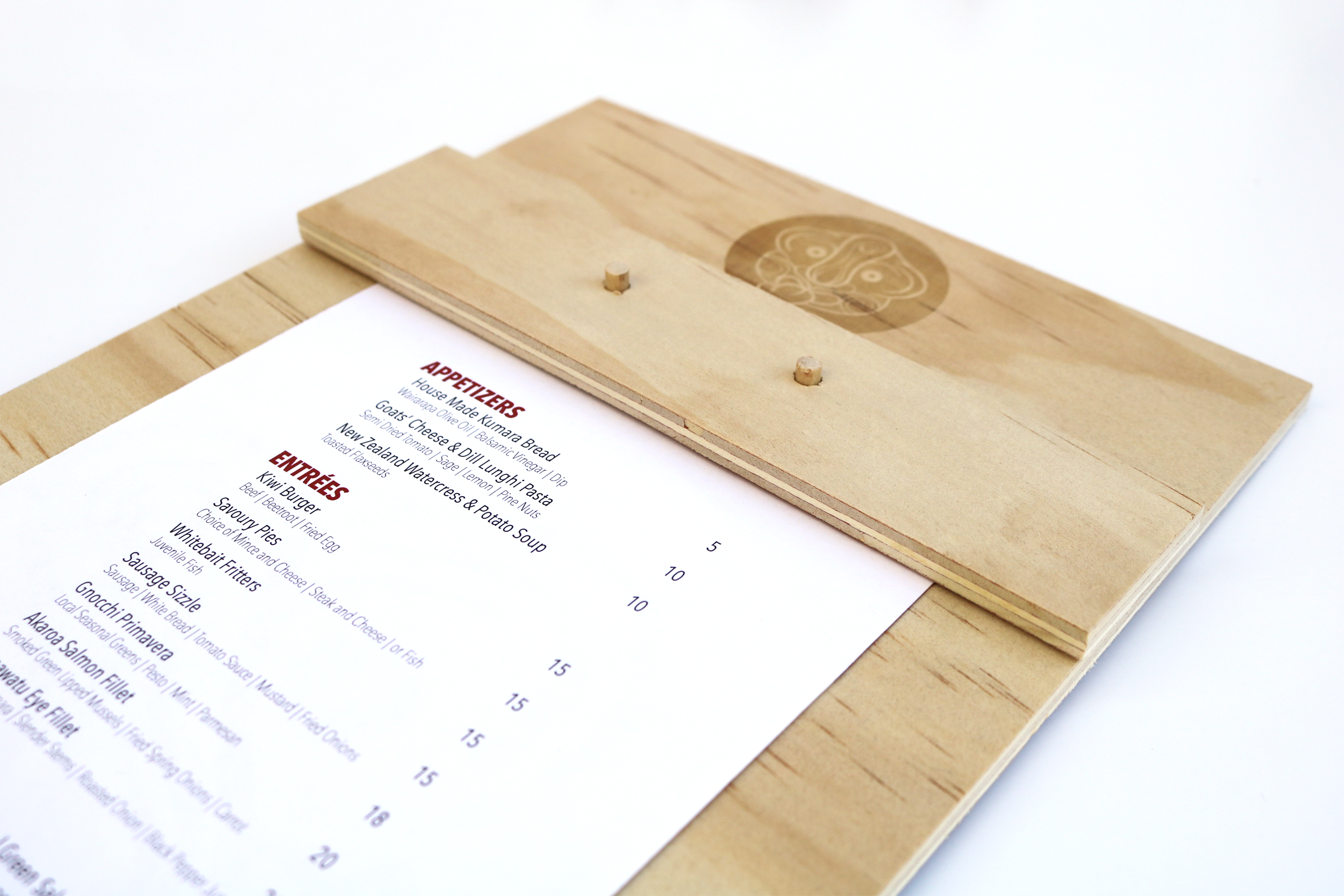
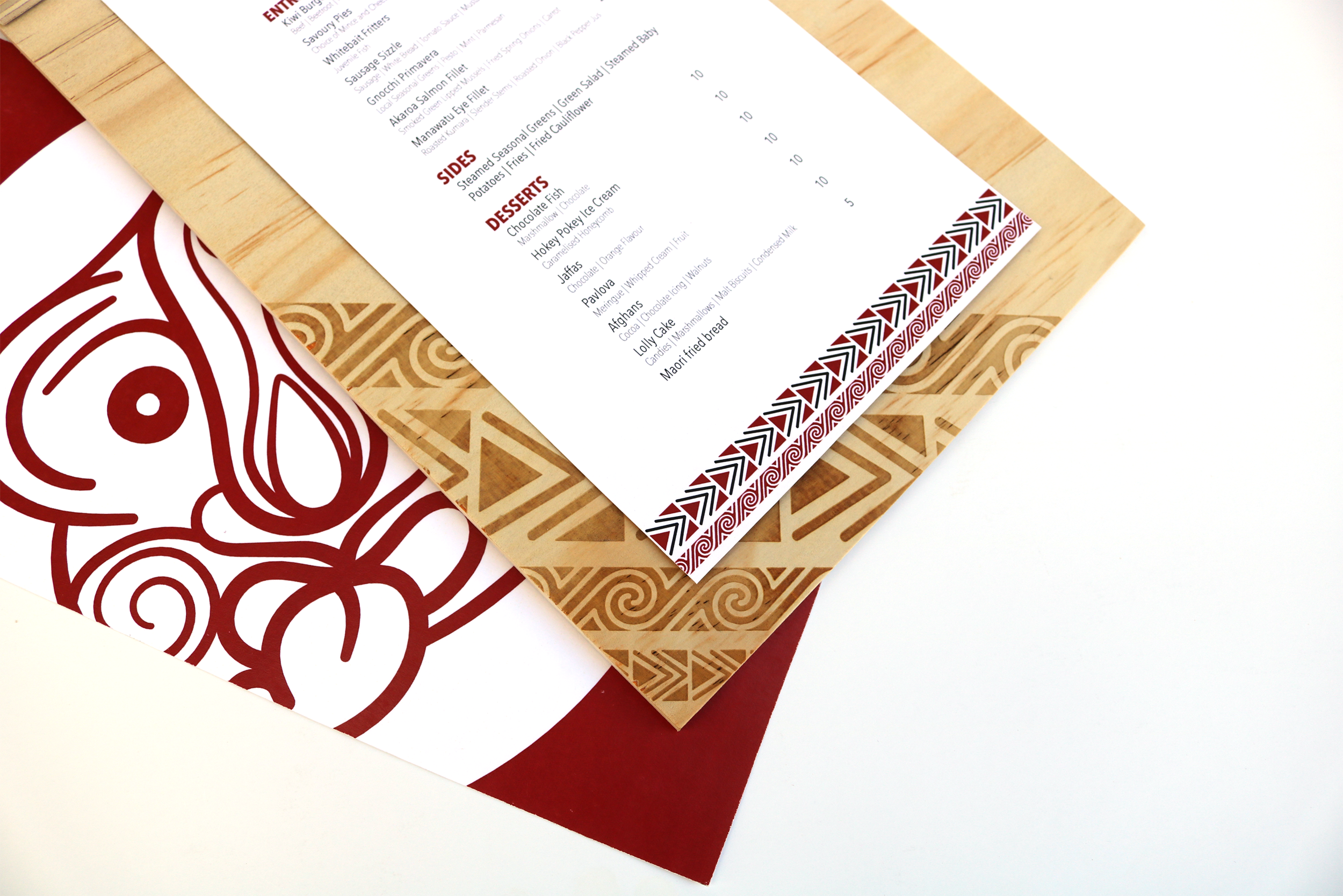
Process: Having chosen New Zealand, I did a lot of research on both the history of the Māori people as well as current issues and trends. As I researched, I kept a list of food that is common for the area as well as native words that could potentially be used as the name of the restaurant. By the time I was done researching, I knew I wanted to base the visual aspects of the brand on a modernized version of the Māori culture. After some wordlist brainstorming, I picked apart what the restaurant’s brand needed to be and express. The name I decided on is Tu Meke which means ‘too much’ and has been adopted by the younger generations as a word for something impressive or awesome. With the meaning of Tu Meke in mind, I constructed a thematic guide with which to build the brand’s visual language from. Several thumbnails for icons, patters, and logos later, I had what I needed to construct the style guide and build from there into what you see here.
Outcome: A well thought out and researched base for the brand to build from.
Categories
Branding
Print Layout
Other User EXPERIENCE Designs